Eine typographische Abhandlung der schlechtesten Plattencover aller Zeiten
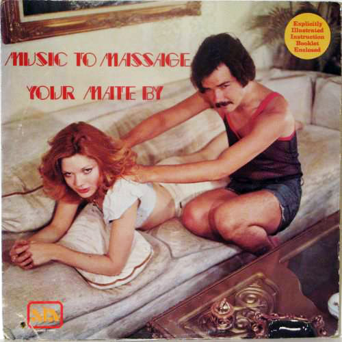
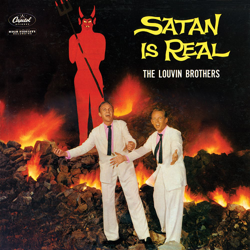
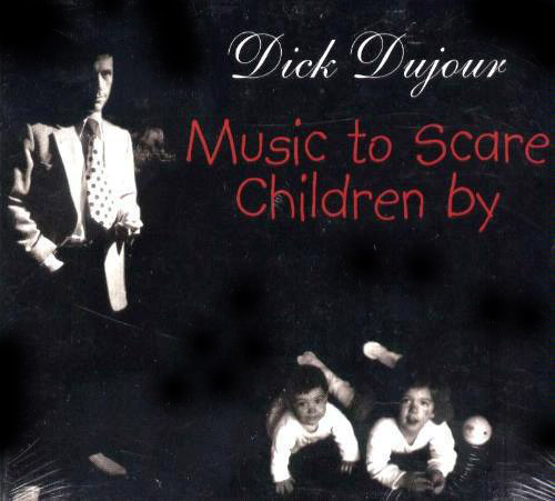
Wednesday, 3.4.2013, 18:11 > daMaxAuf fontfeed.com hat sich Yves Peters die Mühe gemacht, die allerübelsten Plattencoverunfälle aus typographischer Sicht zu sezieren. Das liest dich dann so:
Another rarely seen Mecanorma typeface can be found on Heino’s In Einer Bar In Mexico. The character shapes in Contest are created by elliptical counter forms cut out of curved square outer shapes. This is a great typographic choice as it reprises the typically shaped glasses of the German schlager star.
und sieht so aus:
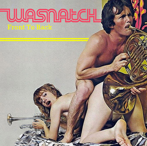
Und auch mein Lieblingsplattencover ist dabei, freu ![]()
(danke, fronti!)

 Artikel als RSS

Forbidden
You don't have permission to access /wp-content/uploads/2013/03/Wasnatch_Front-To-Back.jpg on this server.
@Max, ähm... also von hier aus geht das, aber ich hab das Bild auch selber aufm Server: http://todamax.kicks-ass.net/wp-content/uploads/2013/04/Wasnatch_Front-To-Back.jpg
»My lips are for blowing« und natürlich der Klassiker »handless organist«
http://www.deecee.de/funny-stuff/funny-pics/plattencover.html
Lass mich raten:
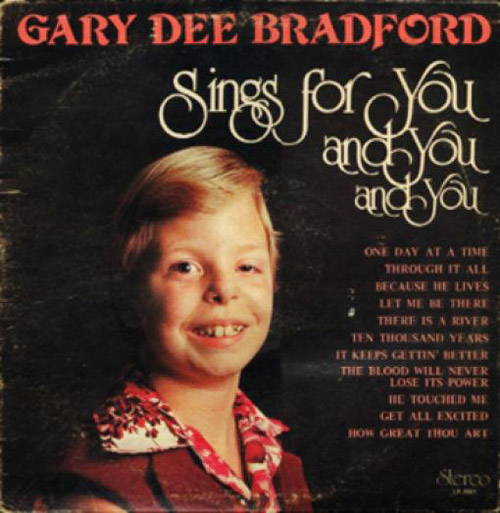
Dein Favorit ist Gary Dee Bradford?
@seilinho, na, mein Liebslingscover habe ich doch verlinkt....
@da]v[ax, Hüstel, stimmt. Aber ich kann den Link auch nicht öffnen. Den auf deinem Server schon.
@seilinho, das ist doch alles weird! ich verlinke jetzt also NUR noch das lokale File. Scheissinternet, ey.